Hi there. I’m Paul, a content strategist and UX writer recognized as one of the Folio:100 most innovative people in media.
Today you can find me at Fidelity Investments, where I am Vice President of Content Strategy.
I’ve also led content design studios and content strategy teams for global B2B, FinTech and consumer brands.
Let me tell you a little about my work.
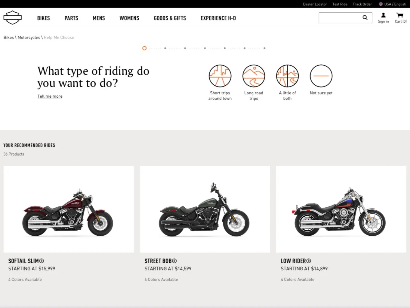
One of my favorite projects was a new content experience for the Harley-Davidson website. Actually, they have two sites, a brand site, where I wrote the content narrative, and an E-comm site where I created a new IA and taxonomy for dozens of product categories.
“Help Me Choose” Application
In order to help our users find the bikes that are the best match for them, I created the “Help Me Choose A Harley-Davidson” app. After answering a series of questions on riding style and preferred riding position, the answers are scored and applied to bikes that shared the selected attributes.
Ecommerce Taxonomy
Harley-Davidson sells apparel, parts and gifts through an e-commerce site we built on SAP Hybris. I created the information architecture and various filters and taxonomies to enable users to shop efficiently. I conducted user testing with motorcycle owners.
Experience H-D Content Creation
Aside from shopping for bikes and gear, the site also includes robust content on the experience of owning, riding and maintaining your Harley-Davidson. I conducted an SEO audit of competitive topics and keywords to build out a narrative. I then wrote the stories and video treatments for each section.
Mattress Firm
The Mattress Matcher is an app that helps you find the exact mattress for your sleeping style. I developed the overall narrative and wrote the content for the “Learn more” drawer to help users understand sleep terminology.
Elevate, Compete, Create.
Mattress Firm Blog Strategy
Mattress Firm was launching a new blog, and they wanted A POV on how they could avoid negative SEO on their existing blog. After I audited the site, I presented several options, including elevating the blog’s status within the UX, uncovering competitive topics and creating authoritative pillar content.
Simplify, Move, Align.
Rest Assured Promise Landing Page
Mattress Firm wanted to combine six existing customer service topics under a single "Rest Assured Promise". After content and link audits, I recommended keeping the existing pages. We chose to build a PLP with links out to the individual topics and little impact on the site SEO.
Contextualize, Clarify, Define.
Mattress Matcher Content Creation
Mattress Firm needed content guiding users through a series of questions on sleep behavior. I designed an interaction pattern to contextualize, clarify and define each question. If the user feels they have enough context, they can answer, if they need clarification, we further define the answers through “learn more” content.
Huggies.com was losing ground to its competitors so a site redesign was in order. However, the effort required a content strategy that maintained domain authority while introducing new e-comm components and thought leadership content.
First things first: The content audit
We set out to reposition Huggies.com as the destination for moms (and dads) seeking authoritative content on baby care. In search, the site historically ranked below Pampers, not just for generic searches but also for baby care content. I identified the articles that had the most page views and then took a look at the rest of the assets with Screaming Frog, retiring old and unused content. I realigned the topics to incorporate competitive keywords and recategorized the files into pillars-and-spokes to increase crosslinking. I also reworked the personalization elements so specific articles would surface along with their companion products in the recommendation carousels.
Microcopy for the cart experience
Huggies.com doesn't fulfill orders from their site. Instead, their shopping cart UI has users select the retailer site where they complete the transaction. This is clear to the user in the simple instruction "Add to Cart at Your Favorite Retailer." The user begins by selecting the size of their baby - the most critical product dimension. Once the user chooses the package count, the three retailers' pricing (Amazon, Walmart, Target) is displayed for the final selection. "Click to save in your favorite cart" is not only an act; it is a decision the user makes based on pricing in their ZIP.
Author, author! A collaborative content matrix
Huggies.com is a global site requiring authoring in multiple languages. I built out a master content matrix for each of the homepages, PLPs, and PDPs. Each component was assigned specific “positions” for each piece of text content. And each position was given a maximum character count for the translations to follow. In the event creative needed to be redesigned for a particular locale, I included a “theme” column, so authors in other sites quickly understood what to convey to the user.


